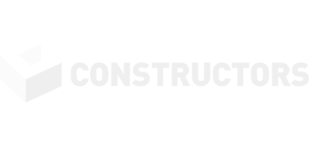
Constructors
On your side

Client: Constructors
Year: 2020
Industry: Building & Fit Out
Services: Corporate identity + Strategy + Web Design
At the center, the brand restyling and the creation of a coherent corporate identity, in continuity with the history of the company born in 2007.
Constuctors is a consolidated reality and one of the leaders in the Building & Fit-Out sector.
We started with a strategic positioning competitors analysis.
We have therefore carried out an update and graphic coordination of all the elements related to the image: creation of a new brand-logo, which conveys the values of the Brand (solidity, concreteness but also the harmony of a design approach that puts the customer at the center ), the selection of corporate colors, the creation of company literature in line with the new graphics, creation of the new website and proposal of a common, flexible format for all company presentations.
We aimed to bring out the uniqueness of Constructors, an Italian reality consolidated on the international market and its particularity in having a double “soul”: the first, solid, as a building constructor and the second, creative, as a designer for the fit out of the environments created, with delivery to the client “turnkey”.
To achieve this result we combined the logo, proposed as a large stylized C in the cold colors range (of greens and blues) that emerges from the background, remind a building, a powerful PAY OFF capable of making explicit the uniqueness of the promise : “ON YOUR SIDE”. To indicate the particular relationship, interactive and fruitful, with the customer.
In 4 languages to communicate the group’s international vocation.
www.constructors.it